The Unionville home underwent a complete transformation. Initially outdated and lacking aesthetic appeal, the clients saw its potential when they purchased it. In our last article, we revealed the full project. Now, let’s delve deeper into one of our favorite spaces in the home: the kitchen.
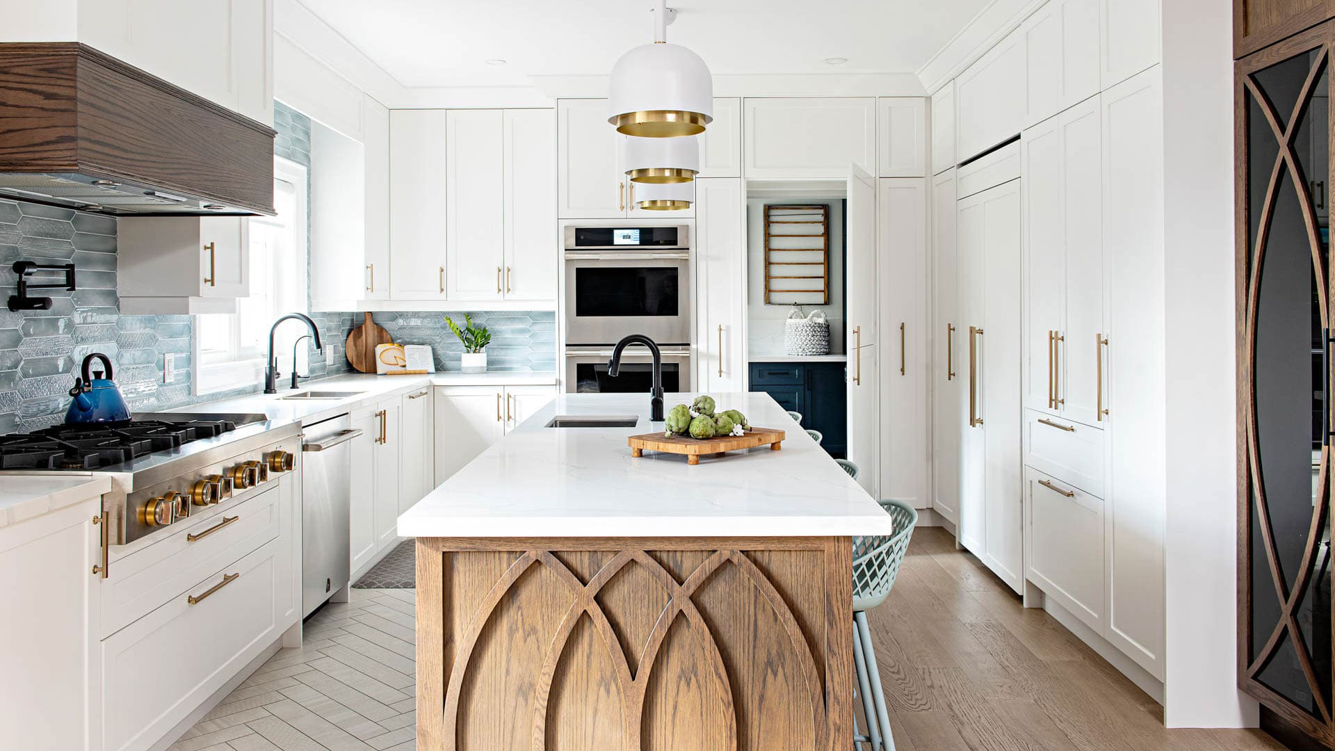
This suburban home featured a typical L-shaped kitchen/breakfast layout at the back of the main floor. The original kitchen, in a baby blue hue, was outdated, lacked storage, and was not functional. Our clients, who are food enthusiasts and love to cook, required a newly designed contemporary kitchen that would flow and function according to their needs.
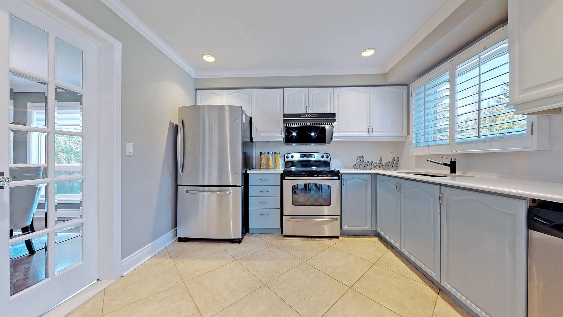
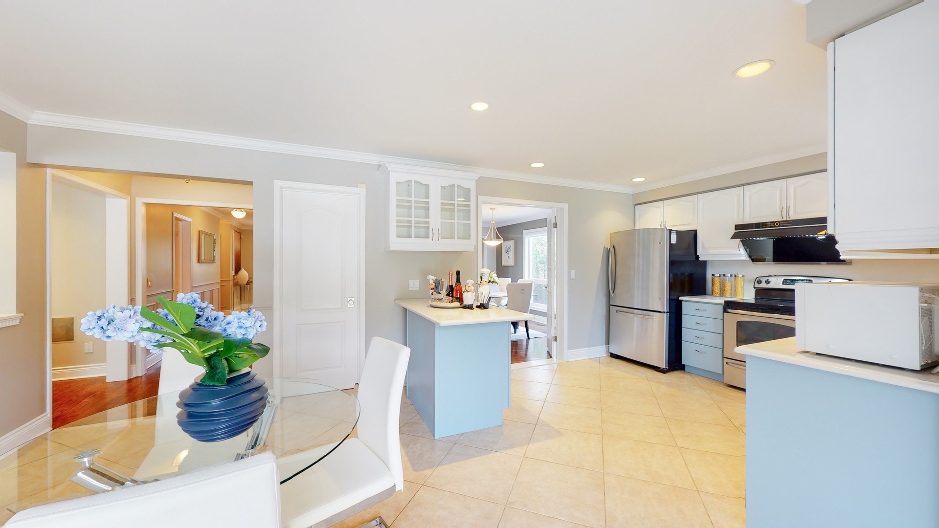
Take a look at the drastic transformation below.

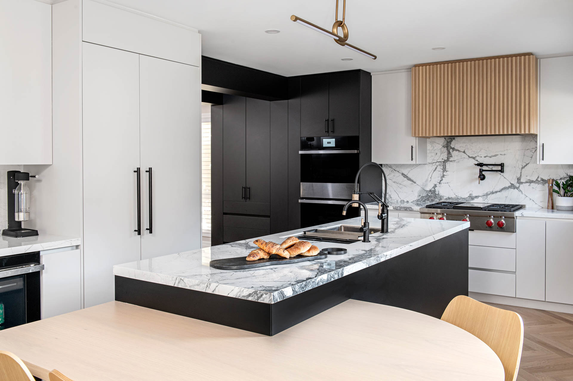
Three major elements guided this kitchen renovation aside from updating the aesthetics: maximizing space and function to accommodate our clients’ needs, creating the perfect flow between cooking, prepping, and storage, and establishing a designated breakfast area with ample counter space for beverages and a coffee station.
Layout, Functions, and Challenges
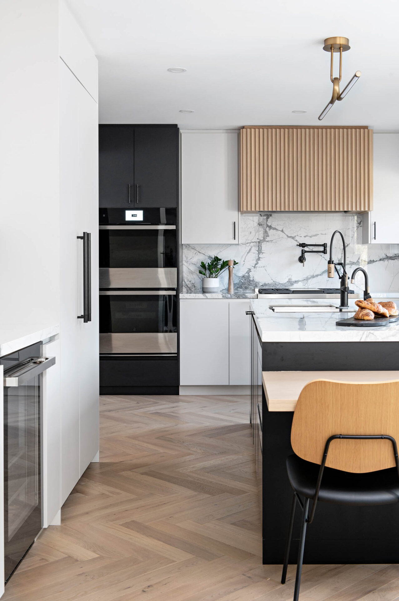
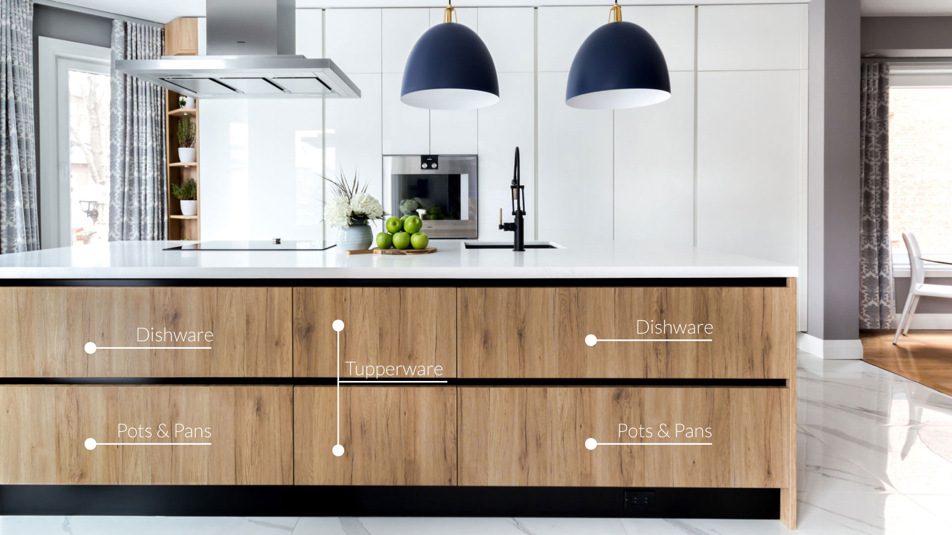
The kitchen space itself was a good size, but its narrowness posed a few challenges. A key feature in utilizing the existing footprint for more function and storage was the cantilevered table off the island. This allowed us to have a larger island, utilize the full wall behind it, and still incorporate seating. It also provided an opportunity to bring the light wood from the hood fan to the tabletop, balancing and warming the space.
We deliberated over the coffee station’s location, ultimately placing it closest to the morning entrance, fridge, and breakfast table. This decision created the most natural flow based on the new layout.
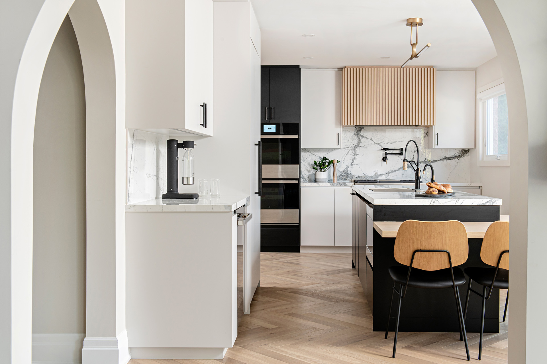
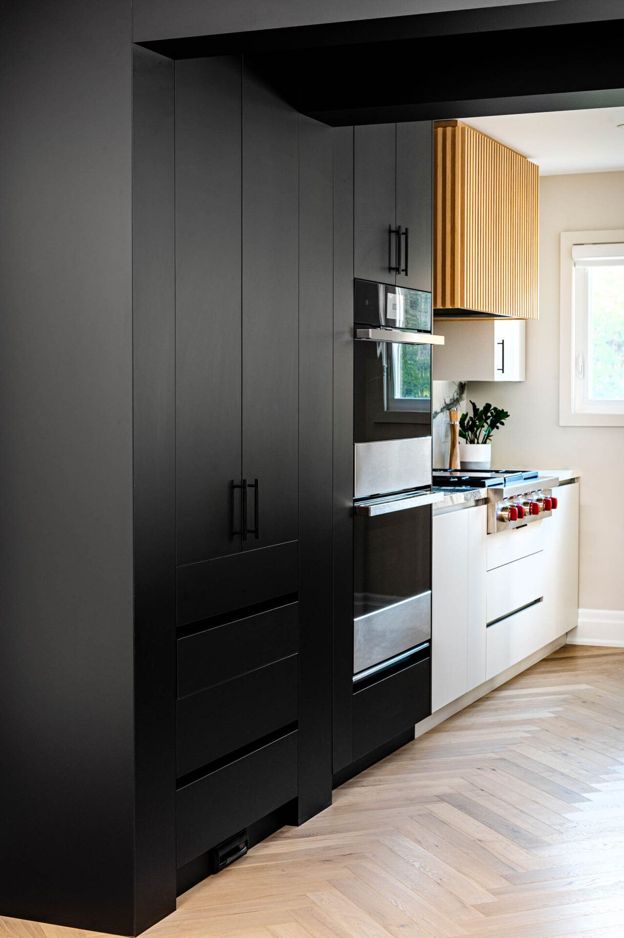
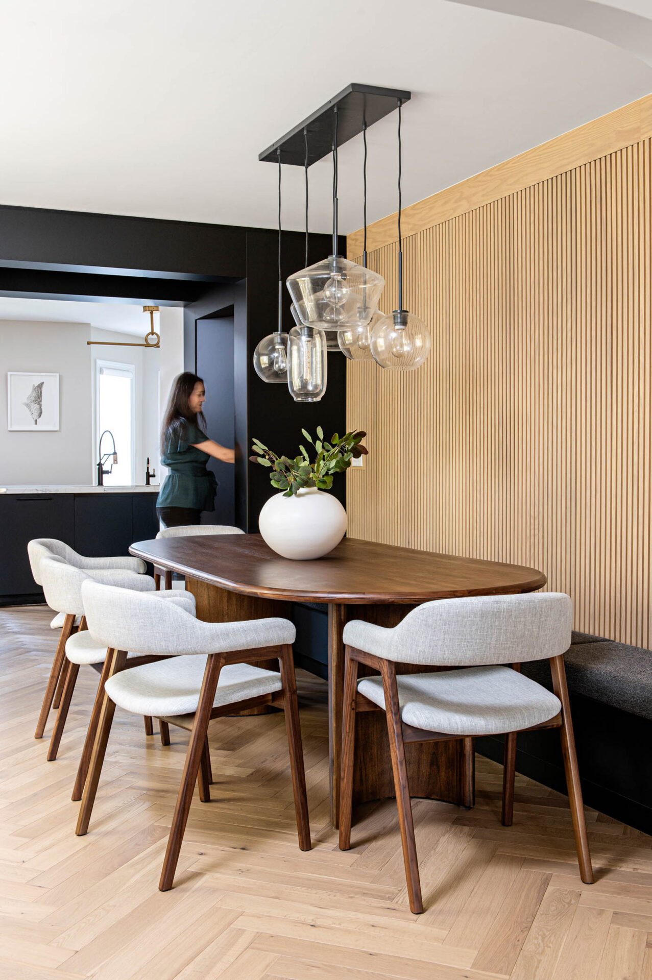
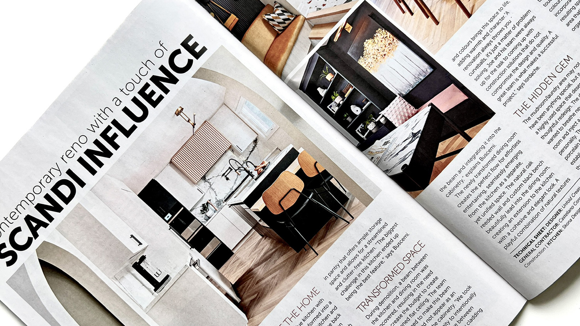
The biggest challenge in this kitchen turned out to be its best feature. During demolition, a structural beam was discovered between the kitchen and dining room wall partition. As expected, we couldn’t have it flush as planned. Sinziana and I brainstormed how to make this intentional and not feel like a random beam interrupting the cabinetry. A faux beam was added, clad in the same cabinetry material, creating a clear transition between the kitchen and dining room and balancing the existing beam on the ceiling. Now, as you turn the corner towards the dining room, you enter a part of the kitchen with a hidden walk-in pantry and a visual division between spaces that allow them to flow seamlessly into each other.

Materials
The clients wanted the space to feel more contemporary with a touch of Scandinavian influence. Not afraid of contrast, we played with black and light gray. We chose light gray instead of white to soften the look. To warm up the space, we introduced natural oak wood. This was applied with the reeded wood hood fan, tabletop, and the engineered herringbone wood floor that runs throughout the main floor. It was also introduced in the dining room to allow the two spaces to flow seamlessly together.
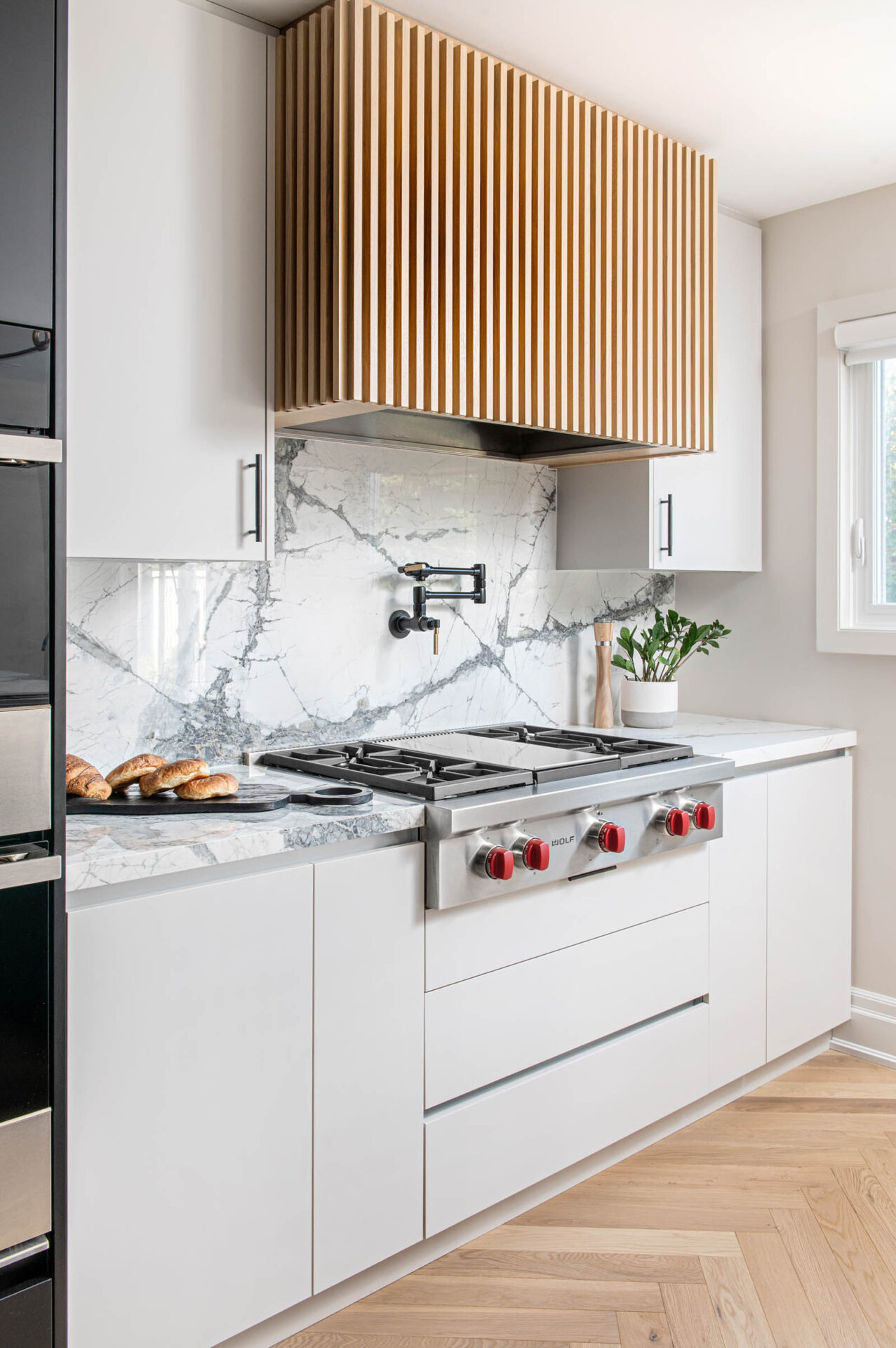
The porcelain countertop and backsplash bring drama to this kitchen. Absolutely stunning, the porcelain countertop and backsplash were major decisions for our clients. Along with its advantages, porcelain does have its disadvantages.
Porcelain is great for replicating the marble look without having to use actual marble. Its tough structure makes it scratch-proof. Besides being easy to keep clean, porcelain is also non-porous and stain-resistant. One major advantage porcelain has over quartz is that direct and prolonged exposure to sunlight won’t discolor it.
One common response we receive when suggesting porcelain is, ‘we heard of someone who installed a porcelain countertop and it cracked down the middle.’ While this can happen, it usually comes down to installation. Not all manufacturers can install porcelain, and it has to be done properly. There are very few installers out there that are skilled, and for this reason, budget becomes a factor. Installation is more than with quartz, for instance.
That said, although a very strong material, porcelain can crack with blunt force, particularly if an edge is hit. Unlike quartz or natural stone that can be filled and buffed, porcelain is harder to repair.
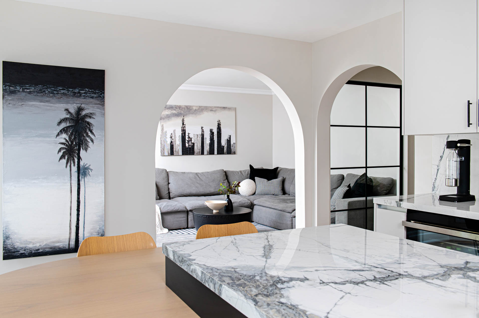
Our best advice when selecting a material for your kitchen counters is to really evaluate how you will use the space. Consider everything from the types of food you prepare to the types of cooking equipment you use, how often your kitchen is used, and who is using it. Each material has its advantages and disadvantages; it’s just a matter of choosing the one that suits your lifestyle.
If you missed it, you can read our article introducing the Unionville project, Unionville Residence Reveal.
Photography by Mike Chajecki
Leave a Reply
You must be logged in to post a comment.