What is the most important space in your home? More often than not, when we ask our clients this question, the answer is the kitchen. It is the space that brings families together, and creates a sense of comfort. The biggest requirement in the Milton Bungalow project was a large kitchen that can unify the space. Lets get into the details of how and why this kitchen was transformed.
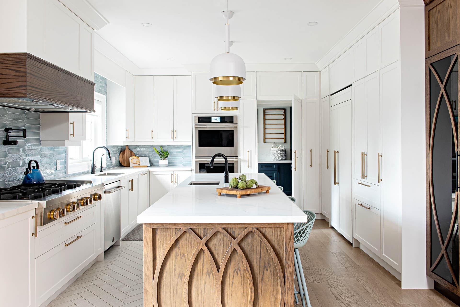
When we first discussed the scope of work with our clients, we were immediately introduced to the importance the kitchen has in their space. They wanted a space that was large enough for everyday cooking, but also one that they could entertain in. The original kitchen, although relatively new, was long and narrow, not quite giving the opportunity for an entertaining environment. A large island was quite important as it not only offers that extra usable counter space, but it creates that get-together point in a kitchen, making it ideal if you also want to use the space for entertaining guests.
We explored various different layouts, but ultimately realized that in order to create a dream kitchen for our clients we had to move a structural wall, something we had hoped to avoid.
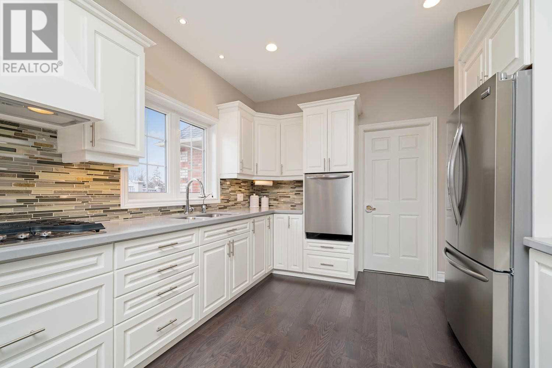
Tip: It’s important to keep in mind that during a large renovation you may be faced with decisions and compromises. It is essential you know what are the most important elements for you, and communicate them to your designer. Their role is to adapt and find solutions that may not always seem obvious.
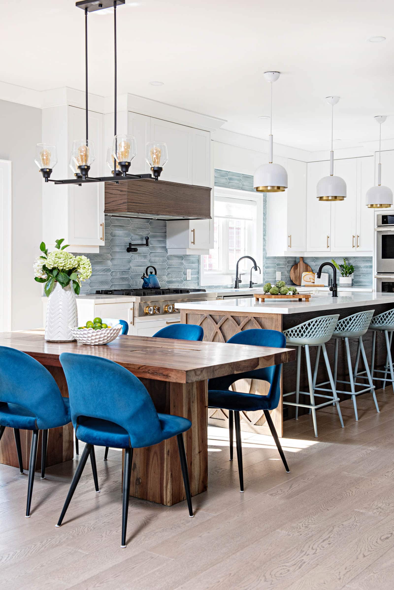
Relocating the structural wall, did not only expand the kitchen, but it completely transformed the main floor. This allowed us to incorporate cabinets on 3 sides, offering tons of both storage and counter space. Gaining those few extra feet allowed us to design a large island equipped with a bar sink, and plenty of seating around it.
The original layout had a door from the kitchen to the laundry. We moved the opening but we did not like the idea of breaking up the cabinets. We wanted to offer our clients a seamless look, which led to the design of the secret door. Made to look like it is part of the cabinets, it brings unity, but also offers an element of surprise. When opened, the view gives us a glimpse of the colourful laundry, which we will reveal in another article.
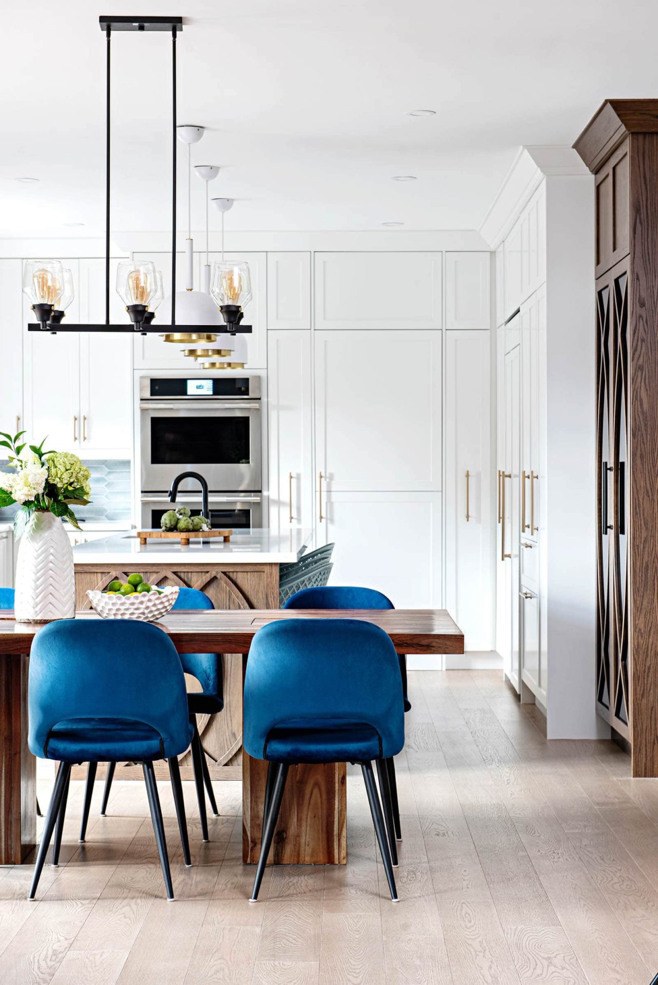
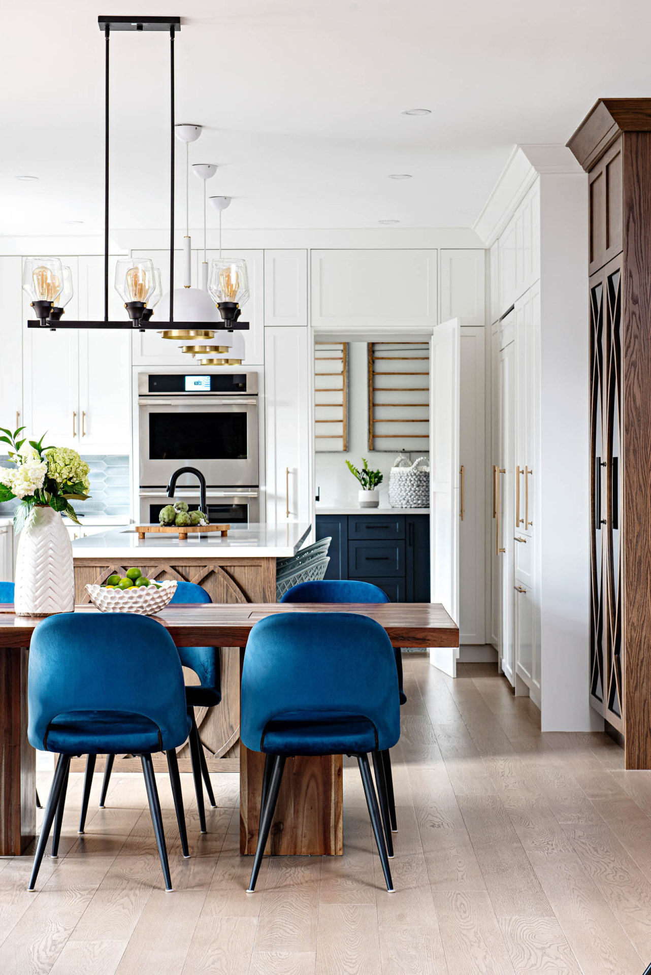
There is no doubt a white kitchen is timeless, but we wanted to add certain details that would not only elevate the design, but create pockets of surprise elements. Alongside the predominant white, warm wood tones were offset by cool blue and aqua tones. A narrow wood display cabinet was added to create a transition between kitchen and living spaces, as well as to bring unity between materials.
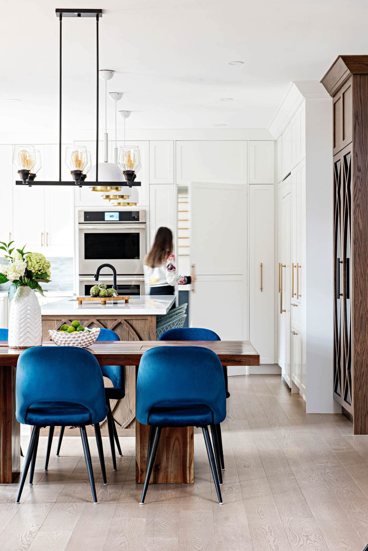
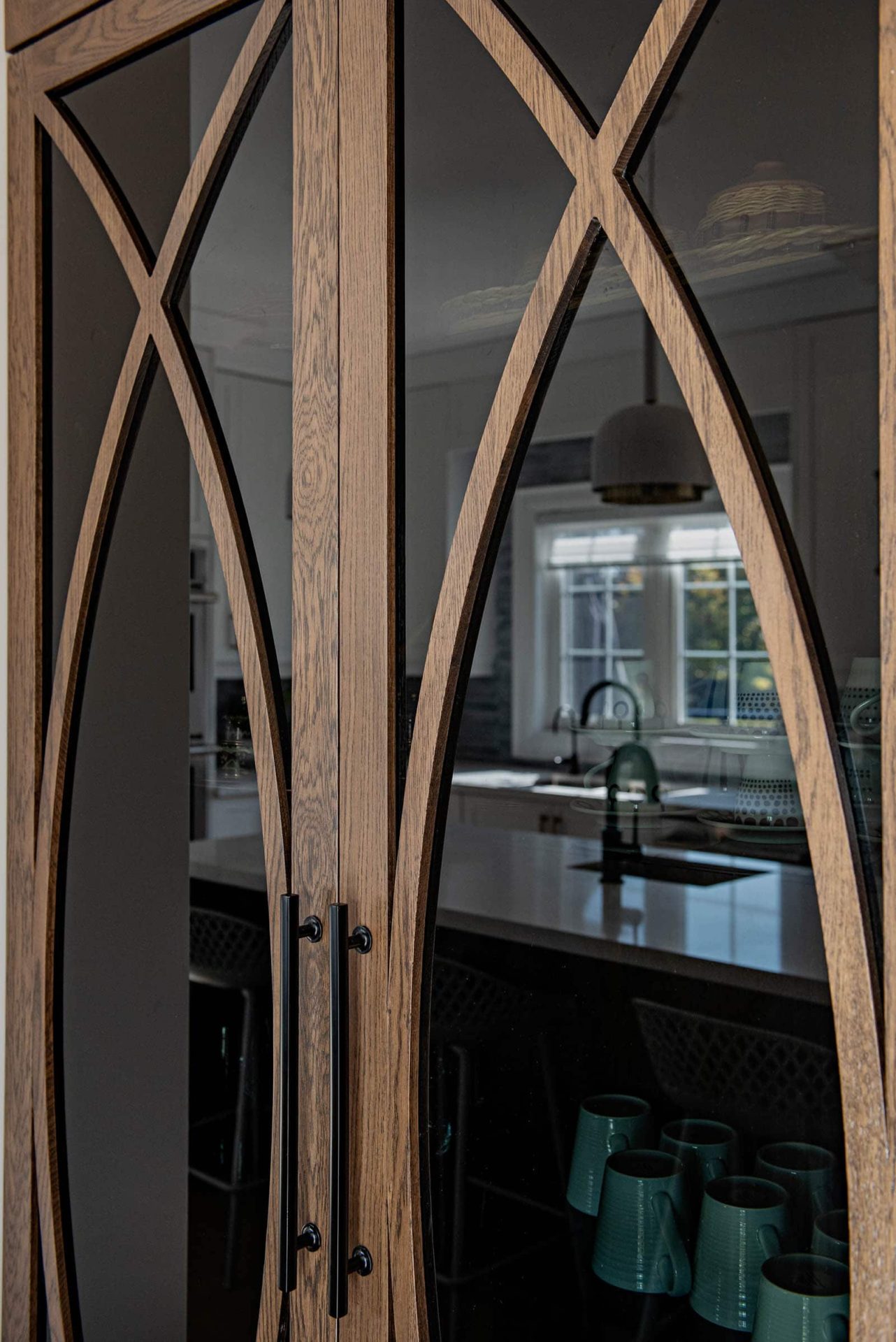
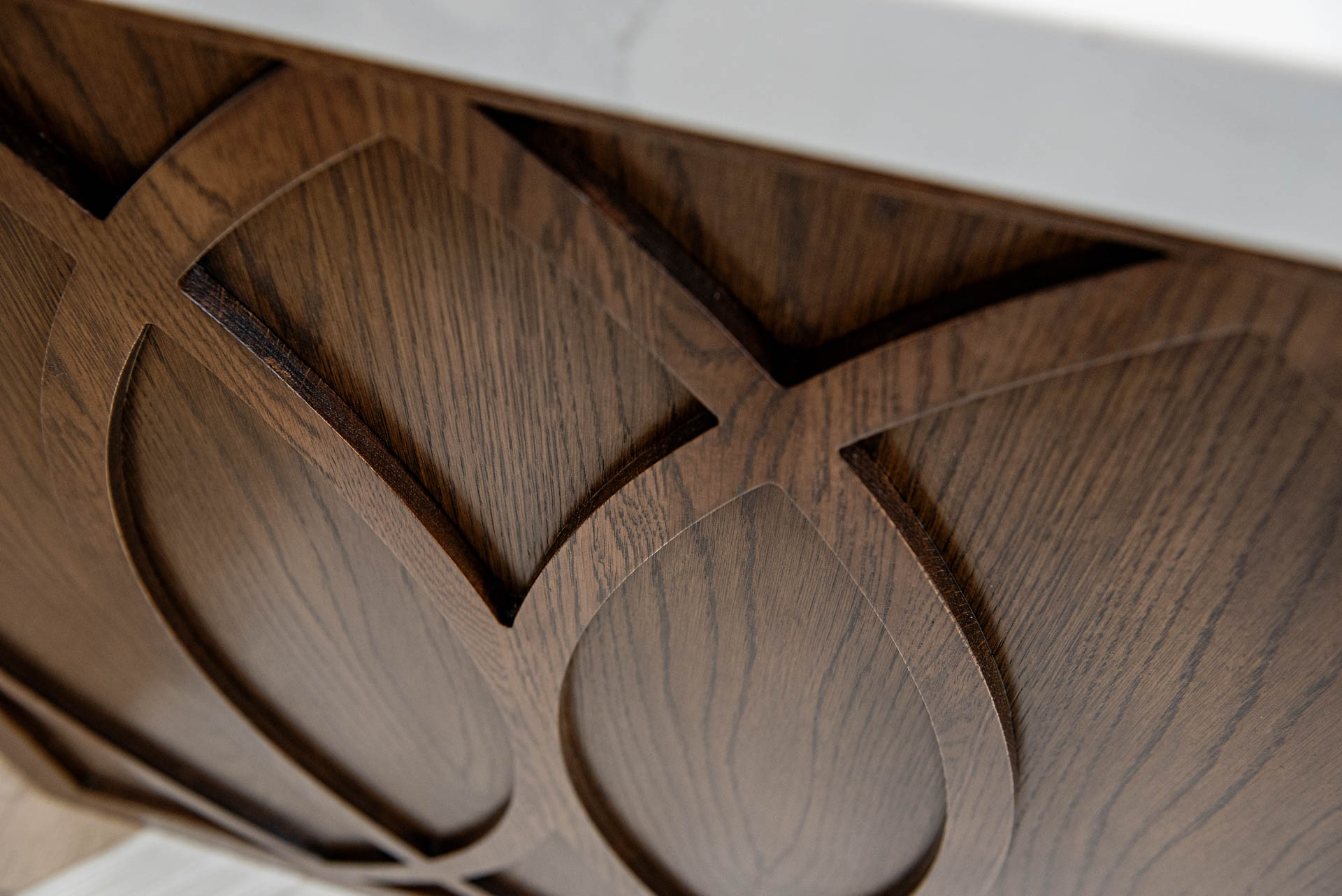
We incorporated lots of texture through flooring, backsplash and even cabinet moulding, in order to create a layered design.
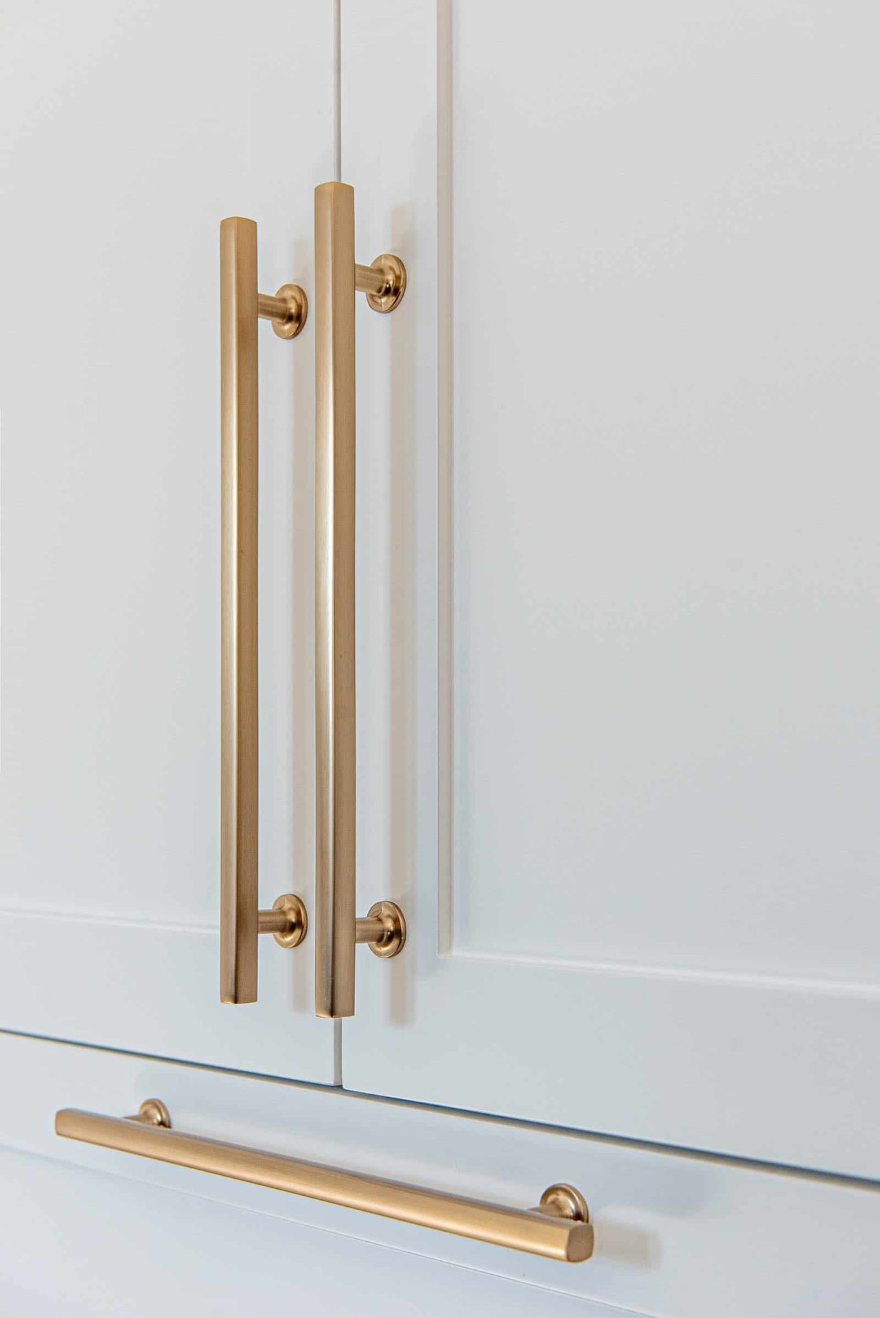
When we initially proposed the gold accents, our client was not thrilled about the idea. Granted, during the 80s, gold has gotten a bad reputation, but finishes have improved so much since then. We wanted to find the right champagne gold that would elevate the kitchen and take out the fear of it being dated soon.
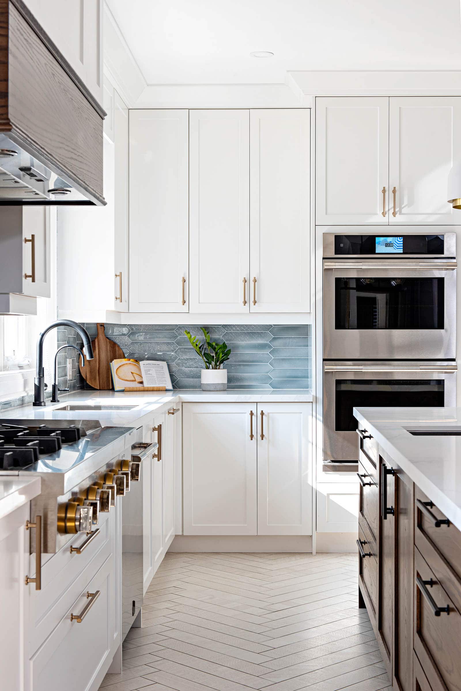
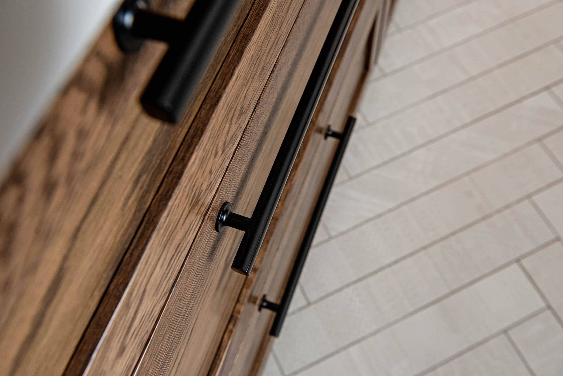
Don’t be afraid to mix metals. In this case we offset the gold by incorporating all black plumbing, as well as using black handles on the island and display cabinet. Combining metals, can not only break up a monotonous look, but it is also a great way to add visual interest and depth to a space.
One rule to always keep in mind is that whatever metals you decide to combine, it is important to repeat them in the space. In the kitchen we made sure both black and gold finishes are used beyond the hardware and plumbing, into lighting and even furniture.
We strongly believe details can make or break a design, so paying extra attention to some often forgotten areas is well worth it in the end. Believe it or not, one of the most challenging elements in this kitchen was the crown moulding. Something that is often left as a last decision, in this case proved to be a coordination exercise between manufacturers and contractors. When we selected the crown moulding for the entire house, we wanted to wrap it around the entire kitchen. This creates a seamless transition between spaces and makes the kitchen cabinets really feel built-in. The two different materials, and supply from various sources, caused a bit of a headache, but when all set and done everyone agreed that extra detail really pulled everything together.

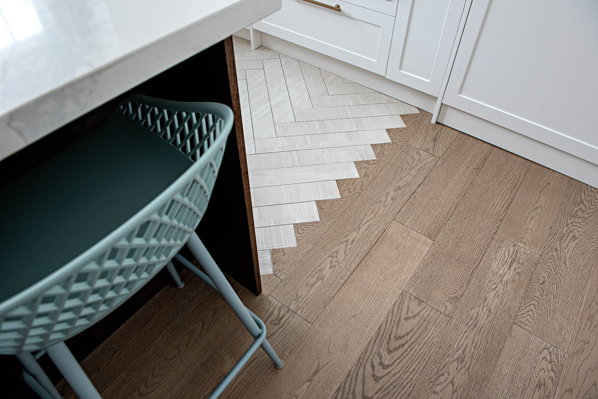
One of the most common questions we get on kitchen flooring is ‘Do we use wood throughout, or tile around the kitchen?’. It’s a question we really think needs to be answered on a case by case. In the Milton Bungalow we saw it as an opportunity to introduce subtle texture, as well as another surprise element.
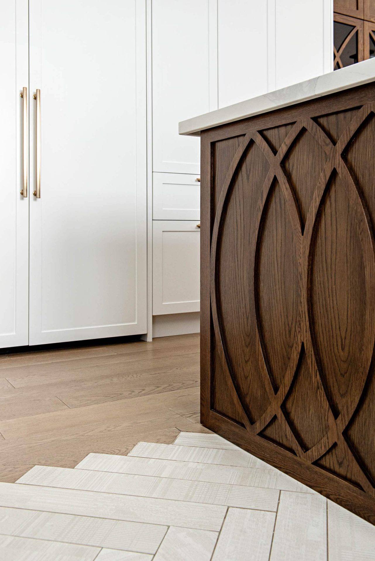
The herringbone tile was intentionally made to feel like it is flowing into the wood floor, an alternative to the typical straight transition we normally use. Beyond the visual interest, it added a clear function separation between the cooking and ‘entertainment’ area.
A kitchen should always encompass a little more than just a cooking spot in your home. Especially if it becomes the hub for your family. We always encourage our clients to see the kitchen beyond a set of cabinets and appliances. The added layers of design offer you a space that doesn’t feel like a chore, but a multifunctional one that can act as entertainment, or simply your kids homework spot.
If you haven’t seen our full reveal of the Milton Bungalow, I encourage you to take a look and get a few sneak peeks as we go through all the spaces in the following weeks.
What are the most important aspects in your kitchen? Let us know in the comment section below or on our Instagram.

Leave a Reply
You must be logged in to post a comment.