At a time where in most places space comes at a premium, there is nothing worse than wasted space. If you search on Pinterest or Instagram, you quickly start to see ‘patterns’ emerging, designs that are marked as ‘the must haves’. While they are visually striking, I rarely see people question if those solutions are right for them and their space.
So what is the purpose of this article you may ask? It is simply to make everyone pause for a minute and ask themselves if a more unconventional layout could actually work better for their space. As a designer, I am part of a team that is often brought in to come up with layouts that would maximize the space. So let’s explore this, shall we?
The next major renovation I am going to tackle in the Vellore Village Residence is the master bathroom. While there is no set date for it, and could be months away, I like to get started and be prepared with the design. This will help me budget, schedule deliveries, and foresee any potential issues before construction starts.
Let’s analyze the current bathroom layout and see why it does not work.
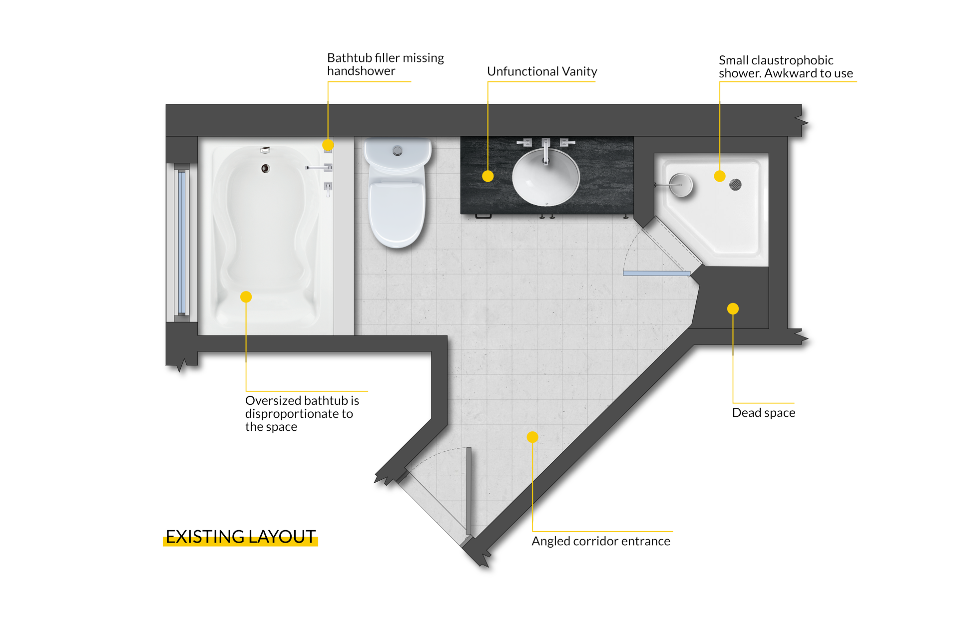
The footprint of the bathroom is actually an odd one with an angled narrow corridor that makes it appear bigger than it is. The actual usable space is long and narrow.
On the left, the built-in bathtub is oversized and does not fit the space well. For whatever reason, the builder decided to not include a proper bathtub filler, making it a pain to clean. The vanity itself is a good size, however highly unfunctional in terms of storage.
The shower is the most surprising element in the space. It is a small corner shower, that is awkward to use and feels claustrophobic. When measuring the space, things did not properly add up, and there was quite a large amount of space that was not accounted for. I quickly realized that there is a large empty space next to the shower that we could utilize. The only explanation that I can think of for such a design flaw, is that the builder did not want to add a bigger shower (maybe cost?) and decided to fit the space to the shower, not the other way around.
Tip: Make a list of what works for you and what doesn’t in the space.
Here are some of the features that are important to include, and how they affect the way the space is used. Freestanding bathtub, vanity with better storage, and a larger shower. Pretty simple demands that you often see with a bathroom renovation.
I toyed with several different layouts, after I made a list of the things and features I would like to add. Ultimately there were 2 layouts that remained, both viable options.
I will start with the more conventional layout, and most obvious solution. Because of the changes involved, this would also be the most cost effective layout.
1. Conventional Layout
Once opening the shower wall, the extra space will help create a larger shower. The traditional curb will be removed to create a seamless transition between the shower and the rest of the bathroom. This will require some pre-planning on the different installation methods, as we will not know the existing condition until demolition is done.

The oversized built-in bathtub would be replaced with a standard freestanding one. The vanity can stay in position, and can be enlarged to accommodate 2 sinks, even though my design will include 1 sink only.
A simple, effective design that will thick all the items on my list. There is nothing wrong with this layout, and as mentioned earlier it would end up being a more cost effective option since most plumbing remains in existing location.
2. Alternative Layout
Lets see the more unconventional layout, and why I am leaning towards it.
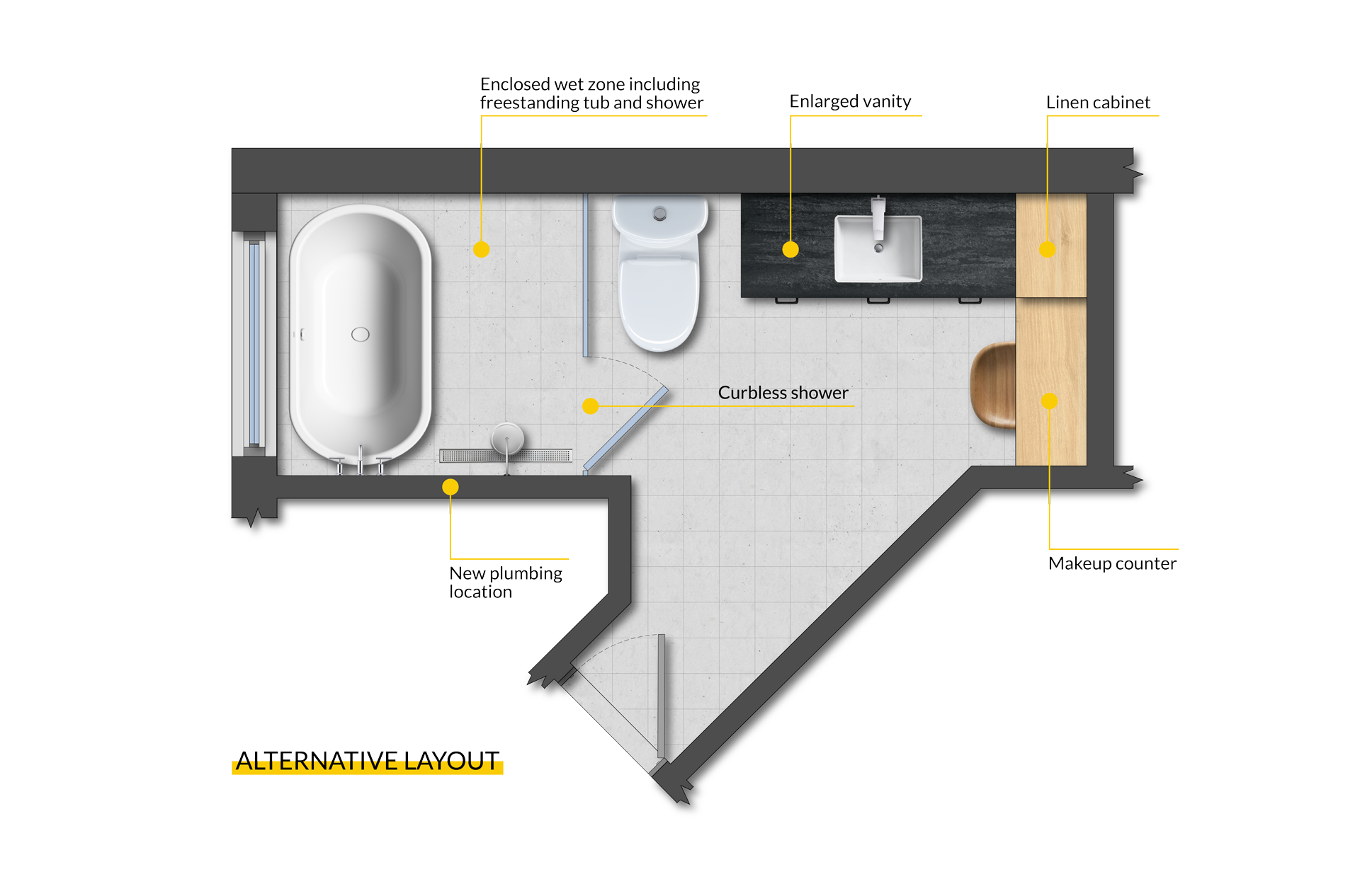
Once again the large tub would be replaced with a small freestanding one. However, the shower area would be moved next to the bathtub to create a seamless wet zone area. Not yet popular in Canada, these wet zones are highly popular in Europe and North American hotels as a great solution for small spaces. The shower will feel even larger, and it will create distinctive zones in the washroom. Plumbing would have to be moved, but having an existing tub in that location makes things easier. The sizing of this space allows for a standard size shower door and panel, keeping the cost down.
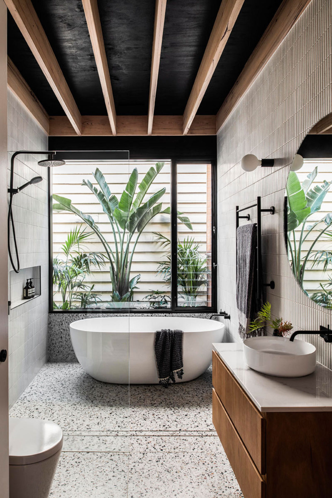
Wetroom example. Bathroom Design by FIGR – Photography by Tom Blachford Organized vanity example. Lineage Double Vanity by James Martin Vanities
The toilet would have to be shifted, but it will still be out of view as you walk in.
Both layout options include an enlarged vanity, but this one allows for extra storage and a make-up table. I am actually very excited by the thought of fitting a make-up table in this space.
Most times people think there is only one layout solution. As designers, our skill-set is to find those alternative solutions in order to make the space as functional as it can be for our clients.
How do you feel about unconventional layouts? What are some of the more important things for you? Is it double sink, large shower, storage? We would like to hear your opinion.
In the following months, will take you through the design choices, the 3D renderings and ultimately the build-out.


Leave a Reply
You must be logged in to post a comment.