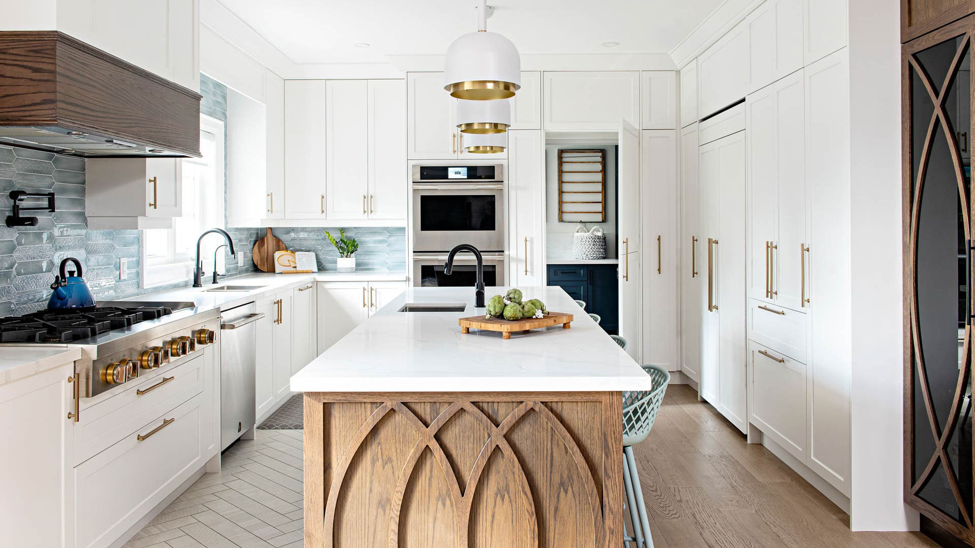
I’ve said it many times, a cohesive design plan for your entire home doesn’t just keep things visually consistent, it also saves time, money, and second-guessing later. The design for the Vellore Village home was created before any of the spaces were modified, and it’s been implemented gradually, stage by stage. Even a year later, we’re still following that original plan as we continue to complete each space. You may have already seen glimpses of this room in our kitchen reveal. It helps give context to how everything connects and flows within this open-concept home. For anyone exploring different living room design ideas, this project shows how consistency across spaces can completely elevate the overall feel of a home.
Before and After: Setting the Tone
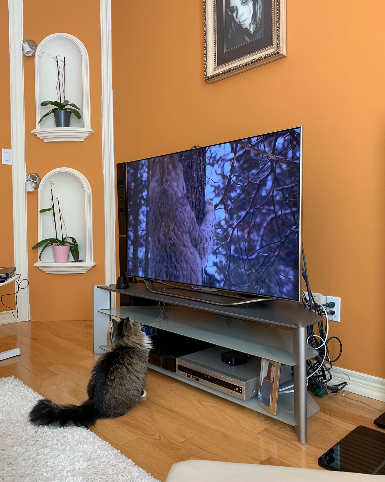
I’ll walk you through what was kept, what was changed, and what’s still to come. I wish I were better at taking before photos in my own home. Since that’s not the case, the only image I could find happens to feature one constant presence in the house, Luna. She never misses a photo opportunity.
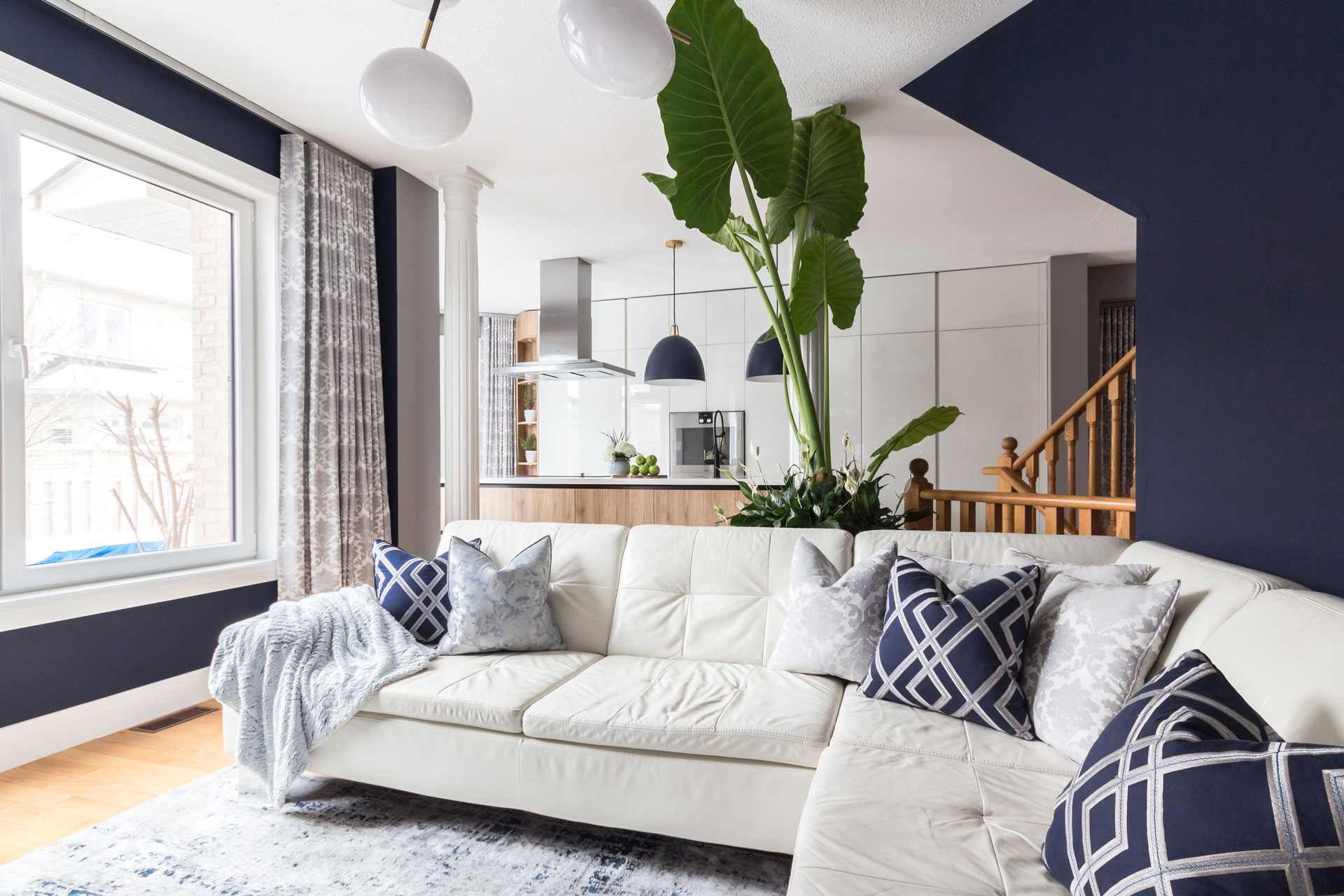
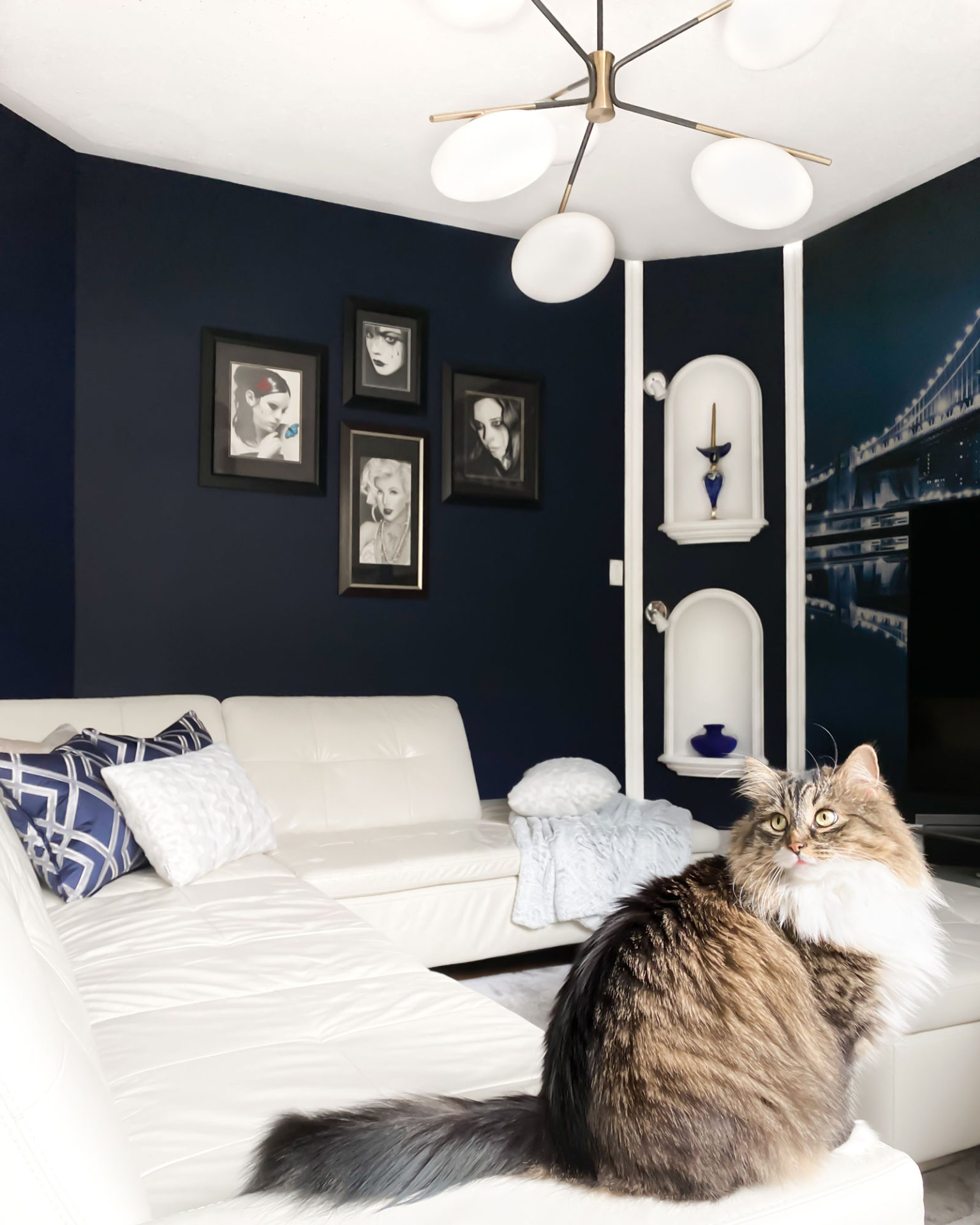
The biggest transformation in this space came from the wall colour. The previous orange tone had been there for over ten years, and it was time for something deeper, something that would create a more relaxed and cozy family room atmosphere.
Working with Dark Wall Colours
Whenever we suggest darker wall colours, there’s usually some hesitation. There’s a common assumption that dark walls will make a space feel smaller or cave-like. In reality, the opposite can happen when the right colour is paired with the right furniture and accessories. Instead of closing the space in, darker tones can add depth, warmth, and just the right amount of drama.
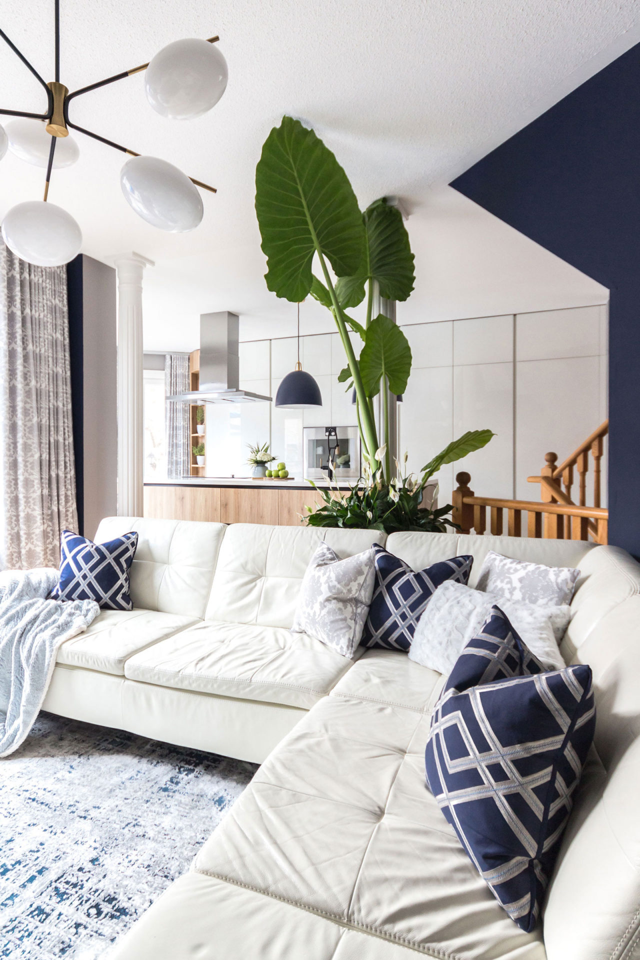
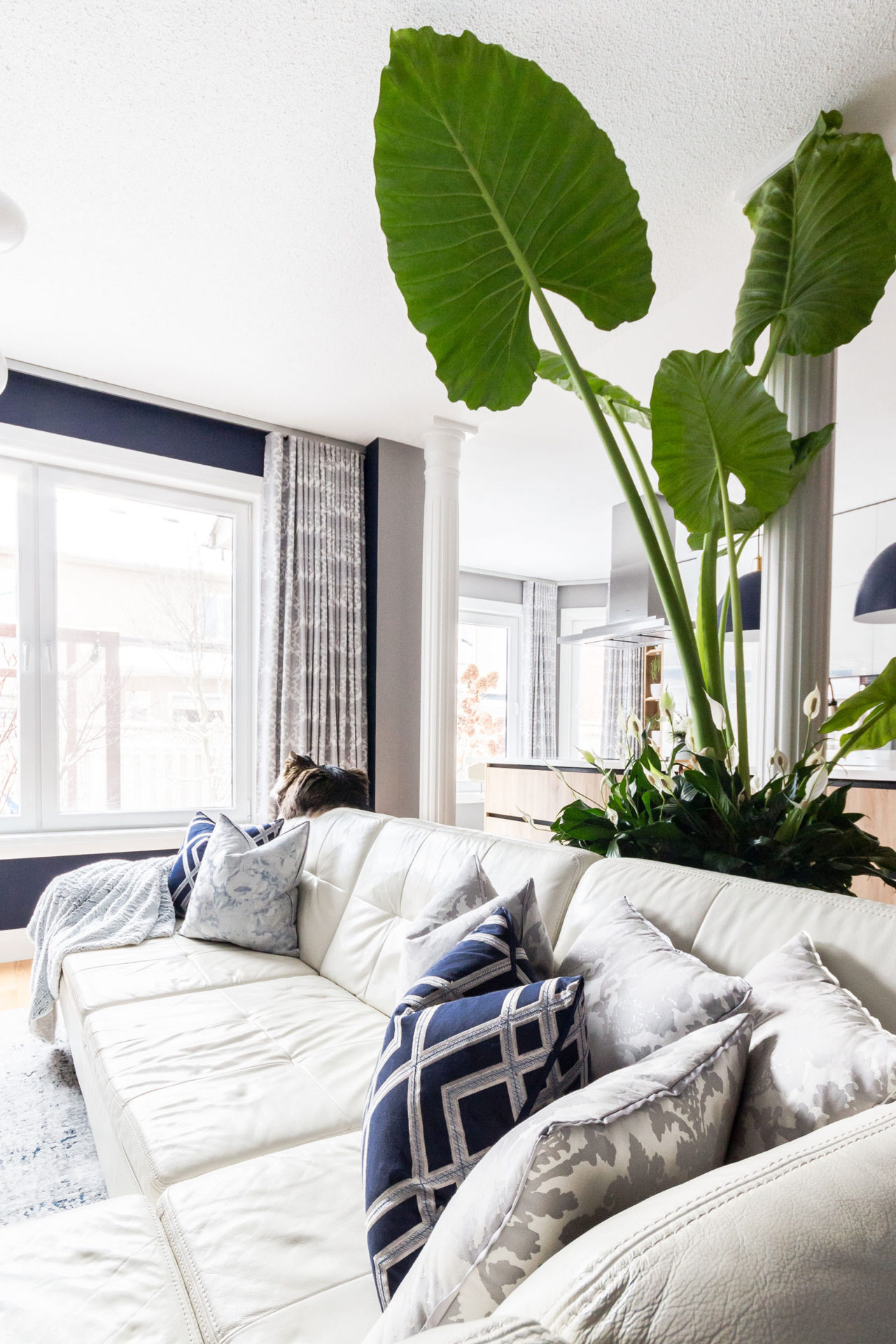
In this case, all the furniture remained. Because of that, I knew a darker wall would allow the existing white pieces to stand out more, creating contrast and balance without replacing everything in the room. This is something I often emphasize when discussing living room design ideas, you don’t always need a full redesign. Sometimes a few intentional changes can completely shift the space.
Finding Inspiration in Personal Pieces
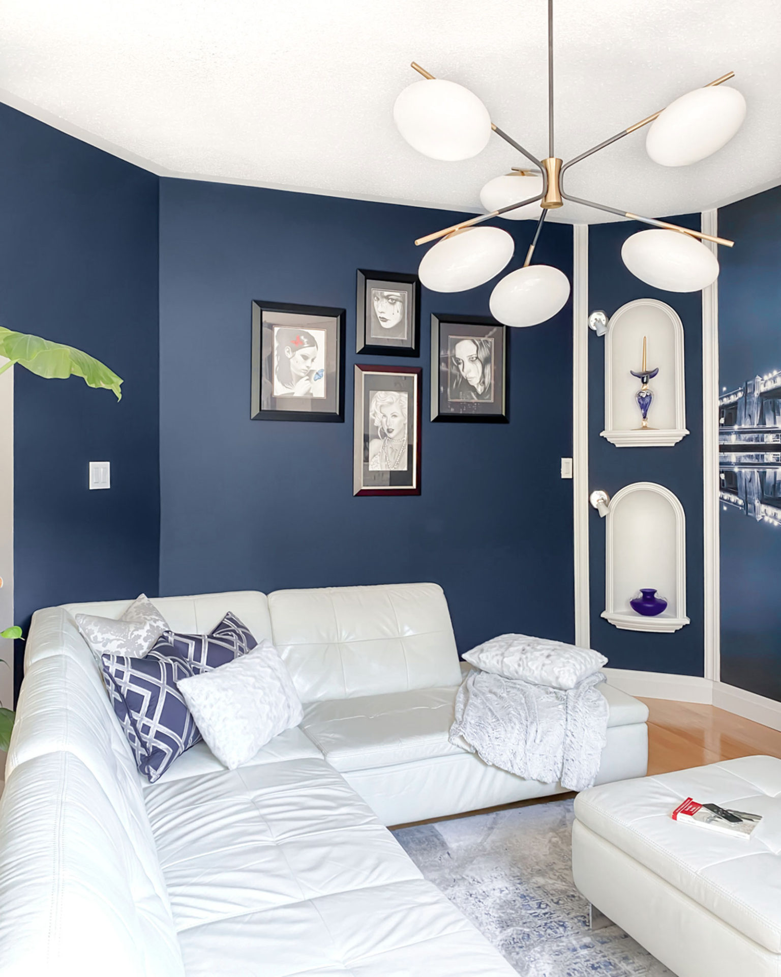
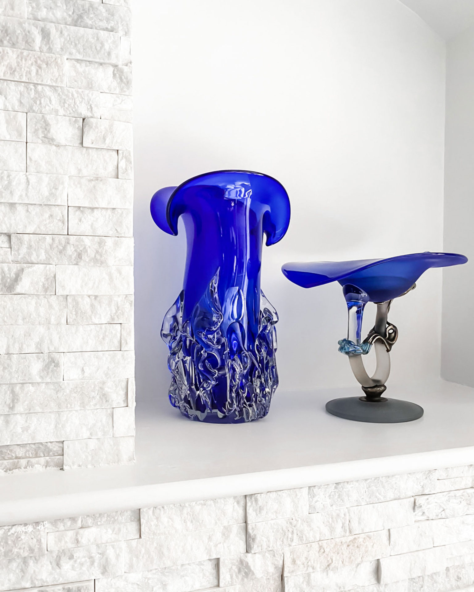
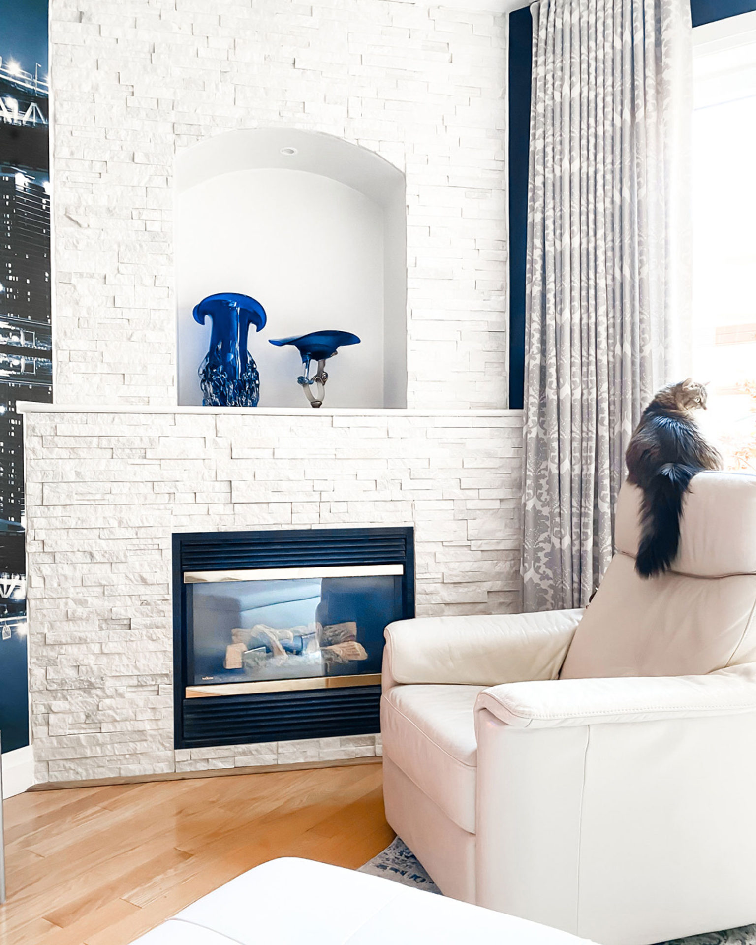
When choosing the colour palette, I turned to something very personal. Our collection of glass art by Romanian artist Ioan Tamaian has grown over the years. It’s become a tradition to bring back a new piece whenever we visit Romania, so it felt natural to use that as inspiration.
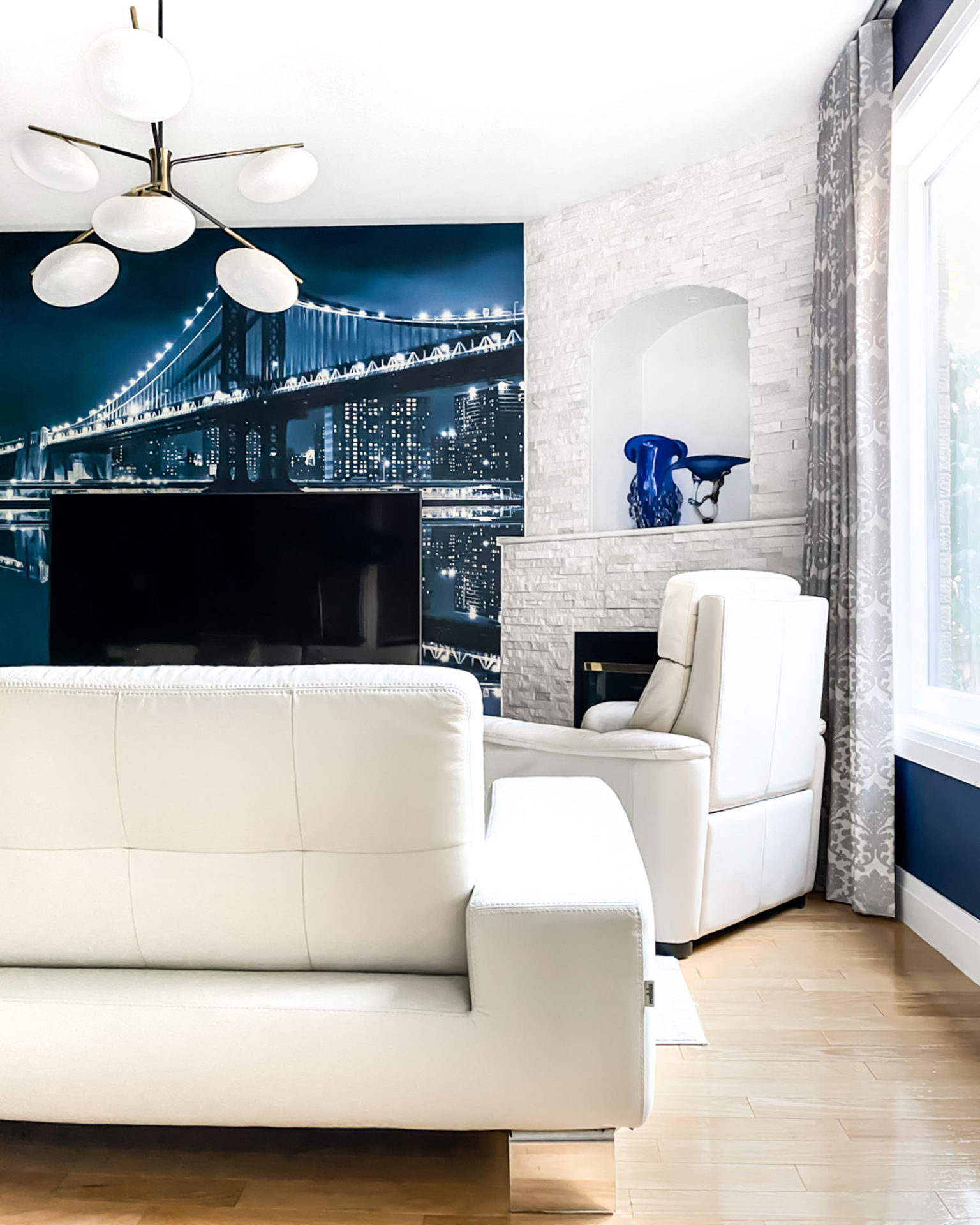
The quartzite fireplace was selected as a backdrop for the artwork. It introduces texture without adding another colour, allowing the art to stand out while still feeling integrated into the overall design.
Choosing the Right Paint Colour
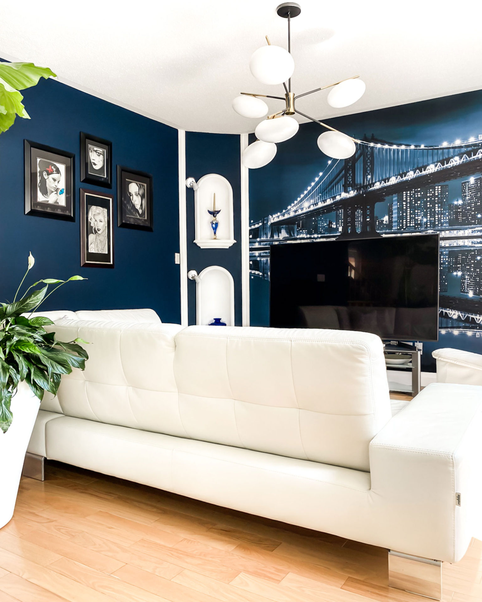
Benjamin Moore’s Old Navy kept standing out during the selection process. It’s a true chameleon colour. In direct sunlight, the blue tones become more vibrant, while in the evening it shifts into something deeper and moodier. That variation was exactly what I was looking for.
A quick tip here. Always test your paint colours in different lighting conditions and at different times of day. The same colour can feel completely different depending on how the light interacts with it.
Layering the Space
The West Elm Champignon Chandelier was one of the most recent additions, but it instantly felt like the piece that tied everything together. It’s elegant, understated, and adds just enough presence without overwhelming the space.
The accessories followed the same approach. Pillows, drapery, and the rug were all selected to complement the overall palette. The rug, from the Torino Collection by Dynamic Rugs, is a low-pile option that has held up surprisingly well, even with the cats occasionally testing its durability. Both the pillows and curtains were custom made to bring in the blues and greys used throughout the main floor, helping maintain that cohesive feel from one space to the next.
The Feature Wall Conversation
The feature wall is probably the most debated element in this space. There’s always the question, are feature walls still relevant? Opinions are split, but my advice is always the same. Don’t focus too much on trends. Instead, think about whether it’s something that feels right for your home.
In this case, the mural was custom designed, with the colour adjusted to match the Old Navy paint. It makes a statement, but because the tones are so closely aligned, it blends in rather than competing with the rest of the room. The result feels cohesive rather than overpowering.
What’s Still to Come
There are still a few elements that will eventually be updated. The TV console, the traditional columns between the living room and kitchen, and the armchair in the corner are all on the list. There’s nothing wrong with them as they are, so there’s no urgency. As with the rest of the home, the transition will happen over time.
Final Thoughts on Living Room Design Ideas
This space is a good reminder that design doesn’t have to happen all at once. Sometimes the most successful rooms are the ones that evolve gradually, where each layer is added with intention rather than rushed decisions. Working with what you already have, and building on it step by step, often leads to a more personal and lasting result.
If you’re exploring living room design ideas, think about how each choice connects to the bigger picture. That’s what ultimately creates a space that feels complete. You can also explore more of our project insights, or revisit the kitchen reveal to see how these design decisions carry throughout the home. Or follow us on Instagram for more real project transformations.
Leave a Reply
You must be logged in to post a comment.